![]()
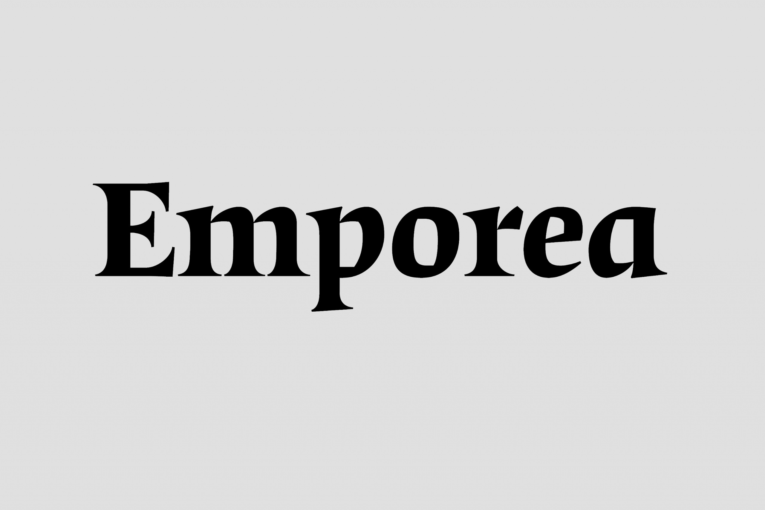
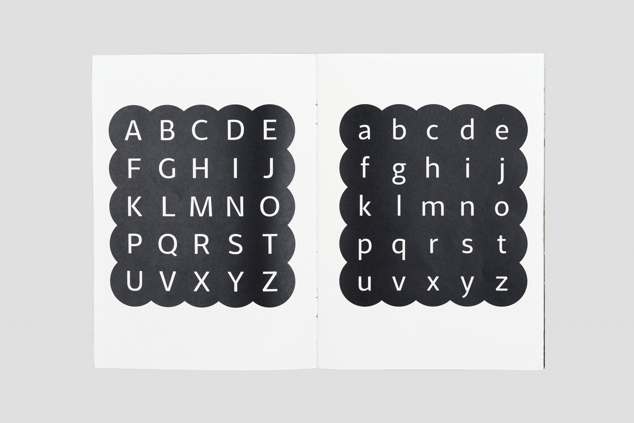
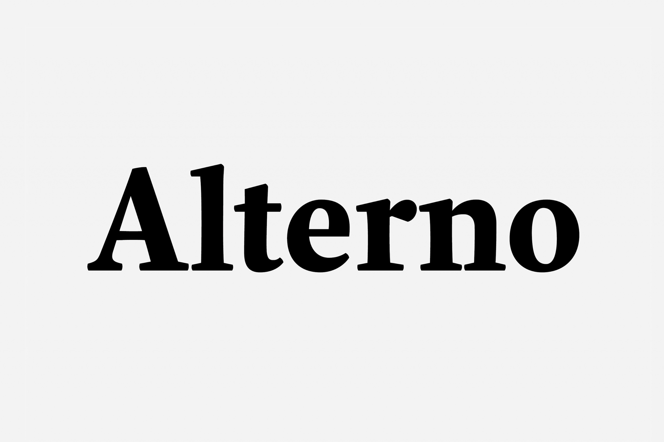
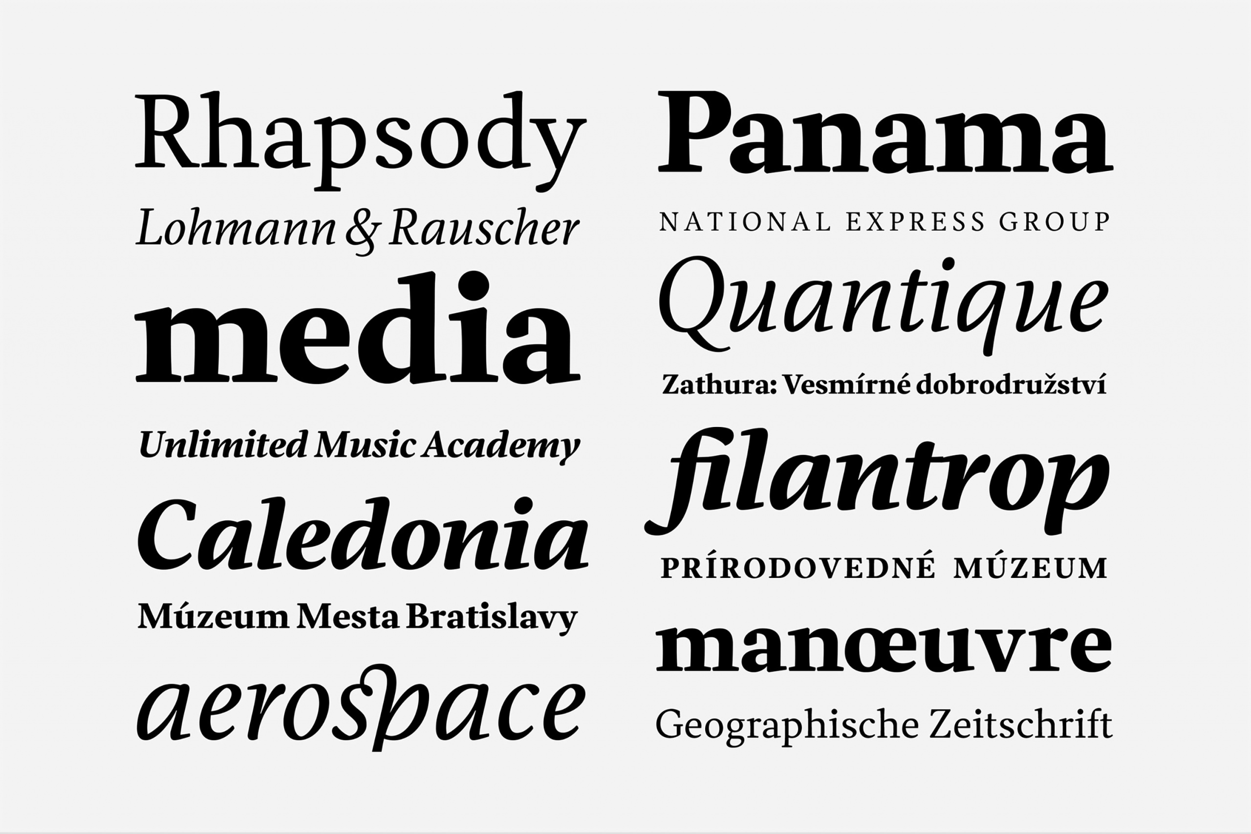
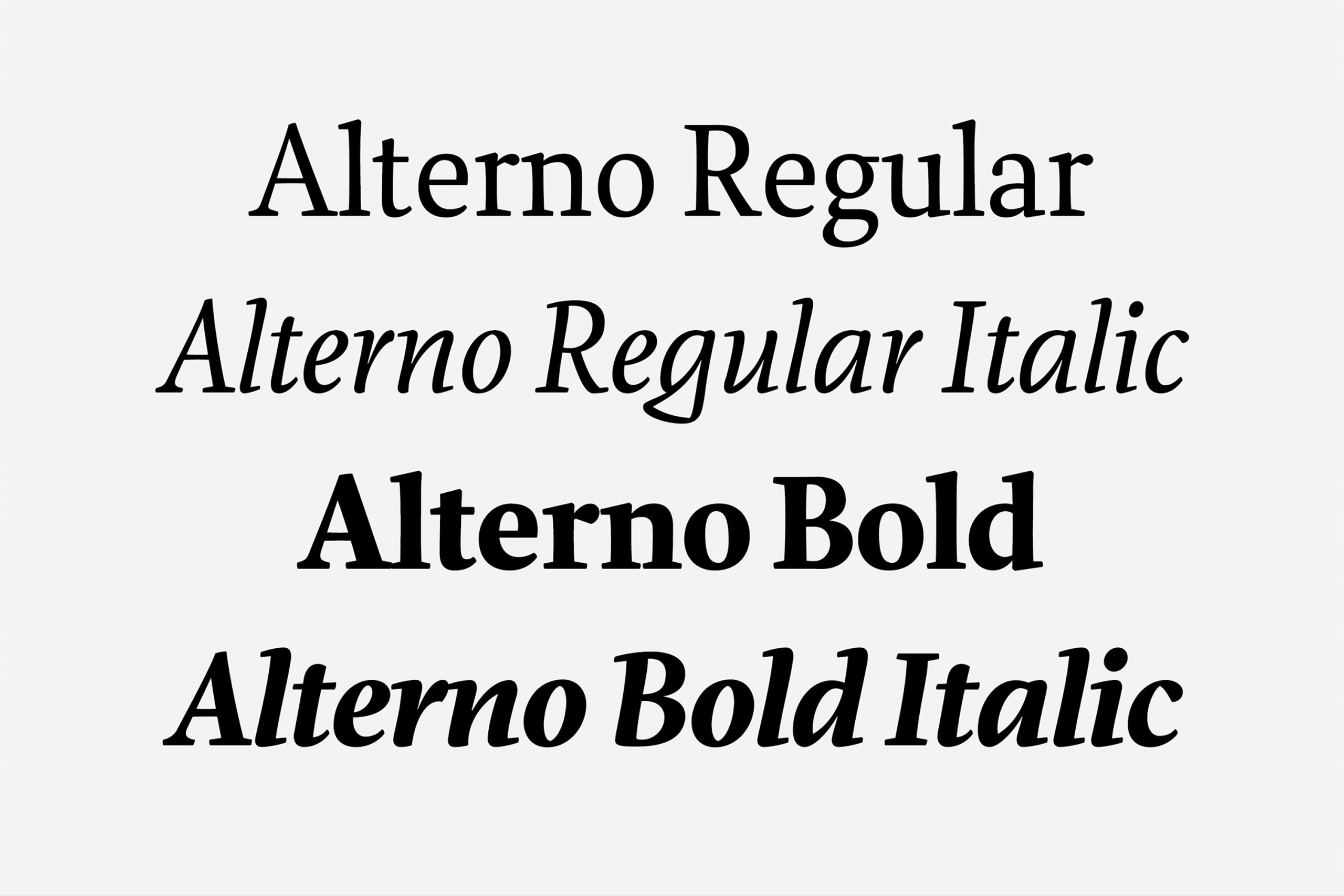
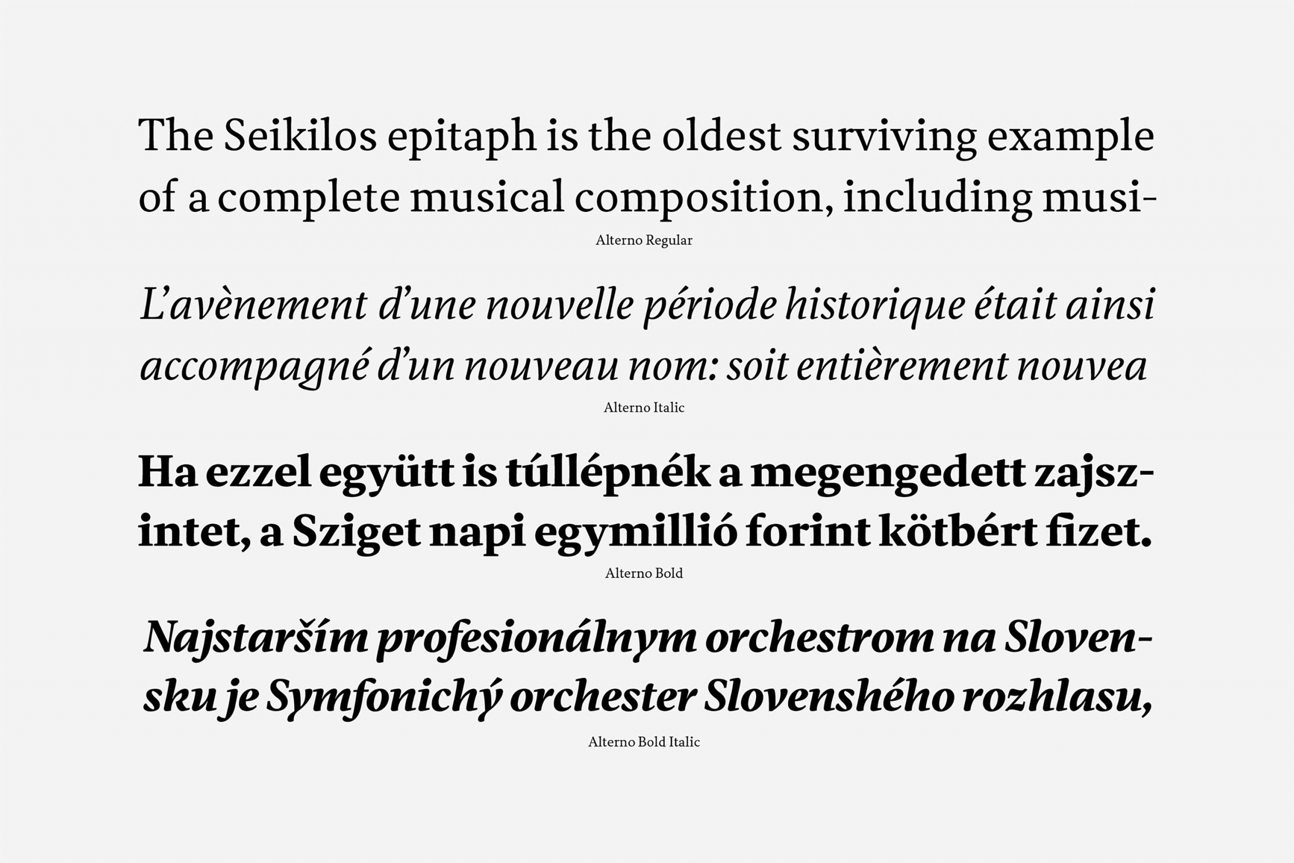
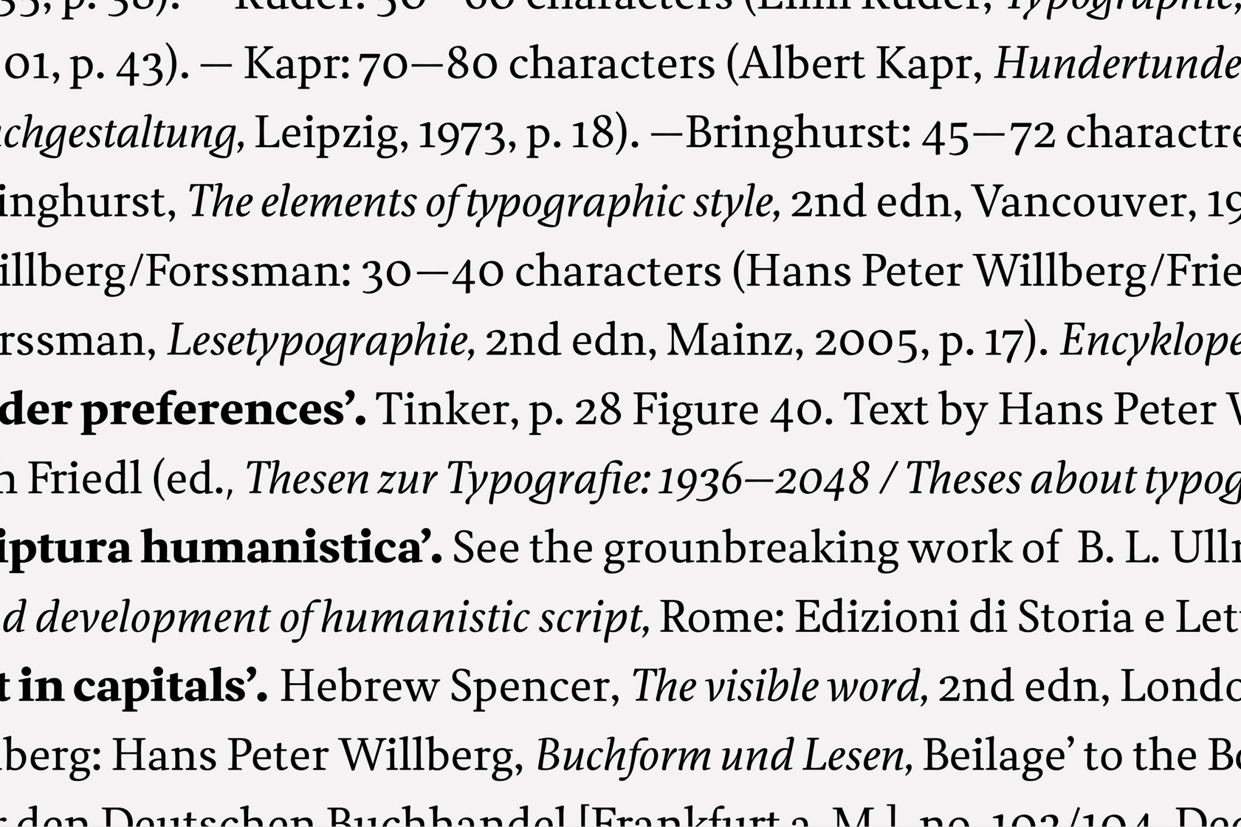
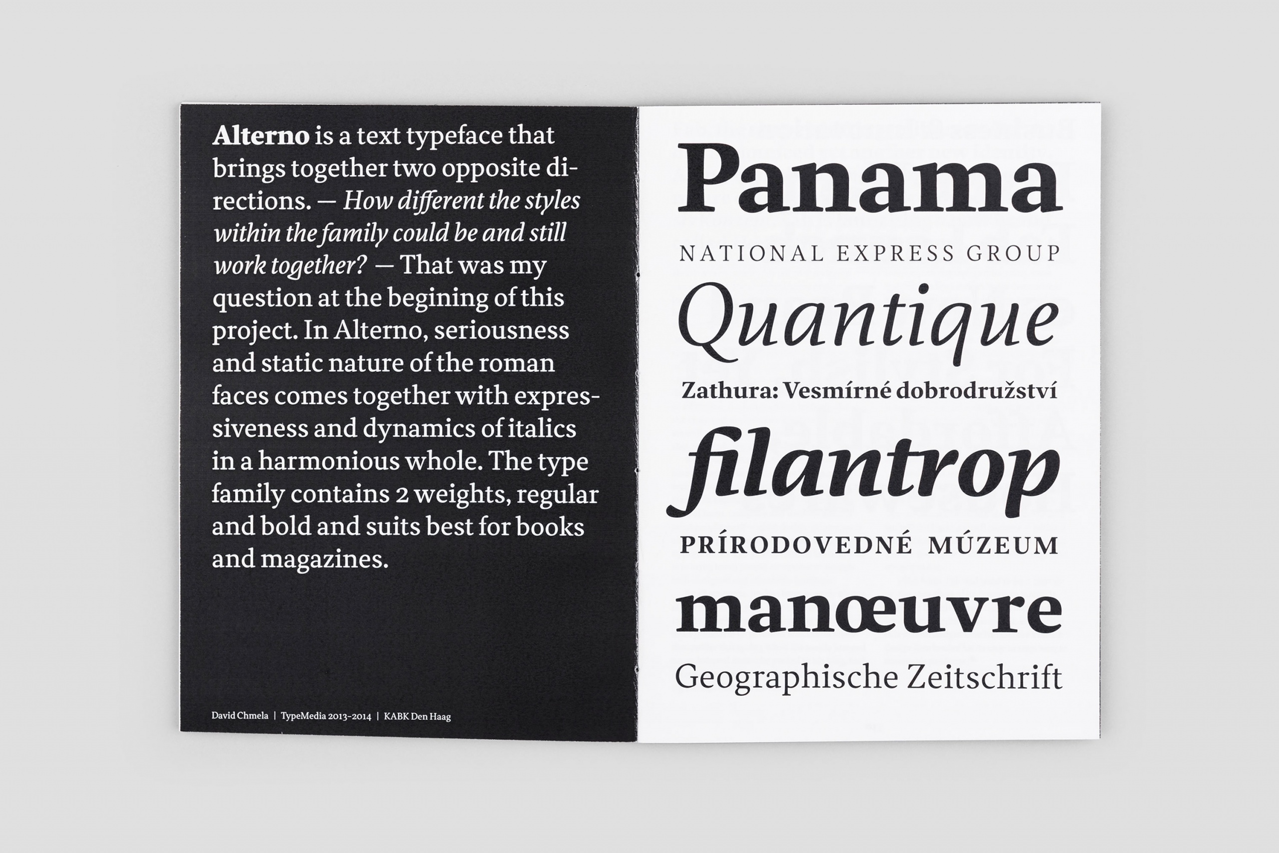
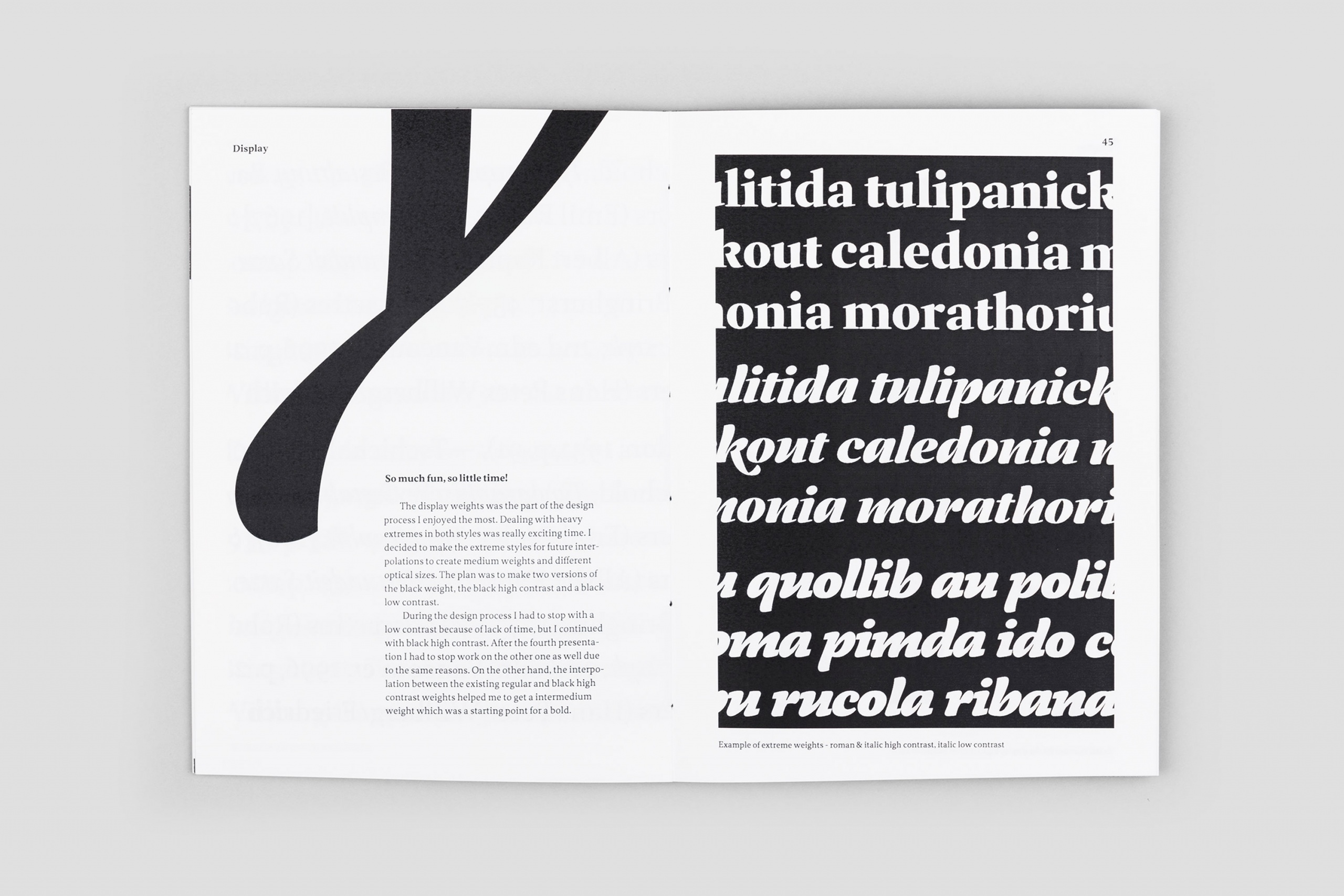
Alterno began as a sort of interest to explore the relationships between roman and italic styles. As the project developed the initial idea of the two opposite directions was move aside to make the typeface work equally well in small reading sizes. Alterno explores the rhythm and texture of sensitive text face and combines serious and static nature of the roman faces with more expressive and dynamic italic in harmonious whole. At the moment the type family contains two weights, regular and bold but it’s planned to expand to a much wider range of weights. Although the typeface was primarily designed for books and magazines it perform as well in display sizes as different medias.
Client: personal
Category: custom typeface
Created: 2014